Neddy Artist Awards
Curated by Ellen Ito
The Neddy Artist Awards gives out 8 prizes, two prizes of 30k and six of 3k, to artists living and working in the Puget Sound area. There are three criteria:
"Artistic excellence and demonstrated commitment to and development of work over time."
"Demonstrated engagement, broadly understood, with the world through art."
"Professional capacity as evidenced by the artist’s career path or implied by a consistent standard of practice for those whose work has not had much public exposure."
Overall: 1.5/5
Strong: ralph salazar
Honorable mention(s): Dana Blume
Everyone else: Jo Cosme, Fumi Amano, Francesca Lohmann, Dana Blume, Lila Thomas, Cristina Martinez
Strong
ralph salazar
salazar’s single work, The Body is Exhausted was the most interesting piece at the show. The piece consists of a large box of weathered styrofoam turned on its side with a small hole at around eye level. The box is mostly untextured, except for the lid, which I thought might have been stone or concrete when I looked from a distance. When one peers through the small hole, there is a very small video of the ocean. I could not see the image moving, nor hear the sound of breathing that was apparently looping.
Like with many artists, I don’t find the statement provided about a work to be that convincing. It’s unclear to me whether it’s salazar’s own words, but I found a statement that indicated that the breathing sound can be indicative of trying to calm oneself down during a panic attack. That statement also said that labor was an important theme in salazar’s work, such that the piece considers the “synchronicity” between the labor in breathing to cope and the fact that styrofoam would labor on in the ocean for hundreds of years past our own death.
There’s a relatively recent (decades long) trend towards art needing to have some personal, daily life, relevance and relatability. I just don't buy into that idea 95% of the time - and I don’t buy into it here. The intention that the piece be about how "breathing is labor" and that "calming down panic attacks" feels like it constrains the piece. Rather than dictating to the viewer what the themes are, I think it’d be generally more successful if artists stopped saying “this piece means XYZ” and started merely saying “this piece was inspired by XYZ.” Especially when, as here, a different aspect of the piece is more striking.
Apart from that, the work succeeds on its own as a piece, independent of any statement. I was struck by several impressions: the first was that I was surprised by the material. Perhaps it was the light, or because I was across the room, but I was really convinced it was some kind of hard stone. It might be that which made me think that the work is reminiscent of a sarcophagus, though turned vertically like this, I’m also struck with the impression of a stone door, as in a mausoleum - one which we can peer into to see what’s inside.
Between the combination of styrofoam and the video of the ocean playing within it, I obviously wondered if the styrofoam had been found floating in the ocean as trash, or if it had turned up on the beach in the video. Imagining that, I found it interesting to think about that what remains with the box is the place where it was discarded.
Even if that is not the case, I appreciated the miniaturization and literal compartmentalization of the environment. That reversal, where what is big and outside is actually small, inside, and can only be viewed through a tiny porthole - and even then, of which only a short, repeating, loop exists - left me with even more of an impression of the fallibility of memory. We try and try to remember who and what is important to us. But as time goes on, and all we have left are our memories, we can only try and repeat what we remember. We start to fail, we lose pieces, details, until all we have are a few dregs that have to carry all that importance - because otherwise we have to admit that we’ve lost so much of what was once so easy to remember.

ralph salazar - The Body is Exhausted (2024)

Sarcophagi at the Metropolitan Museum of Art (New York), courtesy Wikipedia
Honorable Mentions
Dana Blume
I seriously detest the creature that Blume uses in a lot of his works. I find it cartoonish without a reason to be, and childish in a way that I don’t like (though that could mean it’s just challenging me and I need to work through it). Perhaps most importantly, I don’t like the recurring character - recurring characters aren’t interesting to me, and it reminds me of Henry.
Blume is anyway highly skilled, and by far one of the stronger technical artists working around Seattle right now. This photo does not capture it adequately, but I was very impressed with how Blume rendered light and shadow in creating shapes, particularly with the bird in the upper left. I quite liked the hidden rabbits, as well as the thematic contrasts between the spikes/flowers and the blood/cartoonish rendering.

Dana Blume - Too Slow For Friends or Glory (2025)
Everybody Else
Lila Thomas
I found Thomas’s works to be pretty flat, thematically and technically. They’re fine, I guess. The works just struck me as painting photos of friends. Nothing struck me as interesting about the quality of the painting - they were painted true to form, just in a red palette. Nothing struck me regarding the content either. I struggle to write about work like this - there’s nothing impeachable about the idea of painting your friends or painting a photo, but there’s nothing about this work that is art either.

Lila Thomas - Familiar Rhythms (2025)
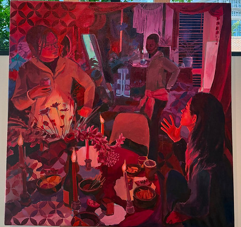
Lila Thomas - A Seat at the Table (2025)
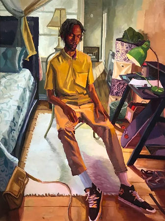
Lila Thomas - Sunday Afternoon (courtesy artist’s website)
In looking at Thomas’s past work, I’m a bit disappointed. It’s clear to me, after viewing her past work, that the red palette was an intentional departure and new avenue. But that’s not just not interesting, especially when the brush strokes, rendering, and content are so plain. Thomas’s past work played with painting more, were compositionally stronger, and were more interesting content wise as well - look at the man’s expression, and the distorted perspective of both the room and the man in Thomas’s Sunday Afternoon, or the faceless child standing outside, foot on a ball, while the viewer looks through an open door in Blue Summer. It seems that Thomas has regressed, rather than exploring her strengths.
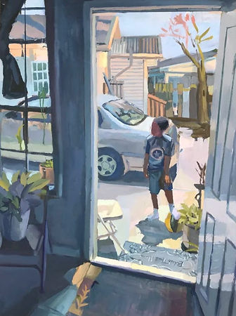
Lila Thomas - Blue Summer (courtesy artist’s website)
Sangram Majumdar
One of the two 30k prize winners. The work just feels lacking in energy, in part because of how unoriginal the works feel. The faces reminded me of James Ensor a bit, which I enjoyed not because of any Ensor influence (which I’d doubt) but because the distorted, simple, faces gave me some pause, especially with how the faces made up almost all of the canvas - but overall, there is FAR too much Basquiat influence. We don’t need any more of that. Pass.
His other, completely different, work Structural Stain just left me feeling “it’s fine I guess.” I like it a bit more a week later. Overall, I found the work to render materials pretty flatly - the reds and yellows here were ultra consistent, and the wall was used merely as a backdrop. Even though it’s huge, and full of lines, the piece doesn’t feel dynamic, and it just didn’t call attention, when that’s all it’s trying to do.
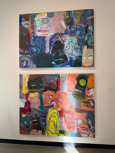
Sangram Majumdar - Agitator 1 (2026) and Agitator 2 (2026)

Sangram Majumdar - Structural Stain (2026)
Cristina Martinez
Heavy Matisse influence. Especially in the line drawings, which I thought were horribly presented. Looked like a school project with all that blue tape and the way they were slightly wrinkled, neither of which seemed to have any relevance - they were just matters of fact.
Her full color works were more successful, but still struck me as basic and reminiscent of 2010’s designs: matisse influence, color blocking, lack of detail, flatly presented, and carry some basic trope (butterflies/a flower losing petals). Though she does stay above wannabe-facebook designer tier.
The most interesting aspects of the pieces was the slight texturing of the skin and hair by some sort of weathering process, and the the use of framing: I liked that the butterflies go into the frame that exists painted into the painting itself in the first painting, and I liked the matching framing and pants in the second. Though, without further exploration, that use of the frame isn’t doing all that much.

Cristina Martinez (no placard for the drawings)

Cristina Martinez - Head in the Clouds (2025)

Cristina Martinez - May the Pedals Teach Us the Art of Letting Go (2025)
Francesca Lohmann
Boring.

Francesca Lohmann - Taffy (unclear number) (2026)
Fumi Amano
Amano works in sculpture, and generally creates some kind of sculpture that centers around femininity. The work presented at the awards is a giant tube that you can get inside of surrounded by bedposts. There seems to be some idea of antique ships wheels as well. But, while the work is expertly crafted, it is thematically uninteresting: the main idea here is the womb as a bed that you can get inside of. As far as metaphors go, it’s bog-standard. And while the piece is overall impressive, I can’t get past how the piece presents that idea as though it’s novel.
I like it more if I start to toy with the idea of dozens of bed posts and what that means, but the impression I get is that the work is solely focused on a Liberal’s conception of women’s empowerment - pussy hat, anyone? - which is to say that nothing about the piece seems to reckon with the equation of biological functions and gender construction. There’s also this weirdly condescending undertone to the work that poses almost nothing new.
Also I loathe interactivity.

Fumi Amano - Womb (year unknown)
Jo Cosme
The two pieces presented by Cosme are 1. a sign printed with a lenticular effect that says Puerto Rico no se vende/Puerto Rico is not for sale and 2. an American flag, without stars, above a claw machine “wrapped in the kitsch aesthetics of a postcard.” That postcard originally says “discover Puerto Rico” but the artist has written “don’t” above it.
…
Walter Benjamin concluded The Work of Art in the Age of Mechanical Reproduction by writing:
"This is the situation of politics which Fascism is rendering aesthetic. Communism responds by politicizing art."
Art like Cosme’s, as an art critic and a Marxist, makes me loathe Benjamin’s prediction.
There is something so out of touch with work such as this. Whether that’s because it presents, as though they’re new and interesting, the same tepid, tired, simplified themes that we’ve all heard ad nauseum over the past decade, or whether it’s because the formal aspects work itself are so passe. It’s just bland. It just straightforwardly says “DONT” over discover. I mean, c’mon. I wonder what the point of the work is?
The work functions neither as an interesting critique of colonialism, imperialism, white supremacy, or anything else, nor as an artwork apart its politics. If we removed the straight forward text what do we have left? The American flag without stars (ok, a little interesting) and a claw machine with stars in it. Everything just has to be some kind of cheap amusement park for adults (more on this in my forthcoming Cannonball review) for attention in Seattle.
Imagine my shock when I learned that this was the other 30k prize winner - work that seems perpetually stuck in limp 2010’s critiques. Exceptionally facile, and unfortunately emblematic of art in Seattle.
Oh and it’s interactive.

Jo Cosme - Puerto Rice no se vende / Puerto rice is Not for Sale (2024)

Jo Cosme - Win a Piece of Paradise! (2025)