Let There Be Light at Cannonball Arts
Curated by Anthony White
Figurative painting is one of my main artistic interests, so I was excited to see a show centering on figurative painting. While I overall enjoyed this show, more than most in Seattle, there was an undercurrent of blandness and overreliance on methods of representing bodies accepted as beautiful.
Overall: 3.5/5
Strong: Canyon Castator, Feather Chiaverini, Jade Thacker, Elizabeth Malaska
Honorable Mentions: Hank Reavis, Callan Ponsford, Gary Hill, Kyle Coniglio, Sarah Jerome, Devan Shimoyama, Angela Santana
Everybody Else: Matthew Stone, Nadia Waheed, Rosalie Gamache, Tip Toland, Skye Volmar, Bryan Rogers, Emma Stern, Samantha Yun Wall, Jen Mann
Strong
Jade Thacker
Probably my favorite overall painter at the show. While I don't think this is Thacker's strongest piece in her oeuvre (I like many of her other paintings much more) Paper Thin still stands out at the show as a complex piece made in a honed visual language.
The work immediately draws one to the eyes, which are clearly painted, and to the lips, jaw line, and mascara brush raised by the woman's left hand across her face to her lower cheek. One clearly sees two other people who seem, based on their positions, to be engaged in some kind of argument. These two people are painted largely within the center woman's forehead and nose, with portions of their bodies, like their hair and arms, extending past the bounds of the woman's face. On the right, we have a dark window - on the left, by one of the other two women and where our center woman's hair would be, we have a window and a lighter patch of white. The bottom of the image is painted flatter and more abstractly.
It's easy to pick up on certain key themes - such as how past experiences can continue to affect how and why we take certain actions, such as putting make up on as we look into a mirror and see the past in ourselves. These, for Thacker, take over the physical body and go past its bounds. The memories, conscious or unconscious, are vivid yet manage to escape clear definition as the rest of the world, perhaps for just a moment.
I don't think the extreme clarity, and standard beauty, of the eyes and jawline help this piece, but c'est la vie.
One thing I appreciate about Thacker's style is that the works feel serious, rather than devolving into a gimmick a la Arcimboldo (who one might draw superficial comparisons with Thacker's work).

Paper Thin by Jade Thacker (2024)
Feather Chiaverini
I was pretty impressed by Chiaverini's work. While I found the materials in Veritable Danseuse De Miami Mecha to be a bit under-engaged with (they appeared to be, for the most part, costume clothes that were clean of any kind of dirt or manipulation that were then assembled into a large character), I loved the muscle suit in a dirty bag. That detail changed the piece from being simple assemblage but added thematically in an interesting way: why is the muscle suit in a bag? There's an engagement with queerness, drag, and the way one reckons with what could be a representation of the literal body being discarded (perhaps in some sort of catharsis) or a vaguer play with the irony of dressing up, in that as we take upon a different character we simultaneously become embody ourselves more; said another way, is it the character or the self which is being bagged up afterwards? Is it both?
What really led me to appreciate Chiaverini's works was seeing both works together. Both Veritable Danseuse De Miami Mecha and Knotman work with covering oneself, but the two work in tandem with one another. Veritable has a sense of humor, there's feathers, a bedazzled bodice, mannequin heads, plastic, while Knotman struck me as quite serious. While Knotman is laid out like a cliche dead body, which could be funny, the piece itself is a thick collection of knots that a person could wear and cover their entire body, including their face. What someone would embody, or be trapped within, is faceless, plain, and tattered. There's something medieval about Knotman, and I'm reminded of hairshirts worn by monks in isolated monasteries. While Veritable has a character, Knotman is anonymous - a John Doe laid out on a plinth. Knotman changes the tone of Veritable by asserting a darker thesis: dressing up as unhappiness, dressing up as an escape.

Veritable Danseuse De Miami Mecha by Feather Chiaverini (2026)

Knotman by Feather Chiaverini (2025)
Canyon Castator
Castator's piece is very large, taking up almost an entire wall. As an image, and object, the piece commands attention. At first, I wasn't sure that I liked why it was commanding - the piece's pastiche of cartoon characters, painted in a variety of styles that conflict with one another, struck me first as very Los Angeles. There is a readiness to parody the American Mass Media Image Tradition - maximizing American hallmarks, i.e. Jesus, shotguns, cowboys, soldiers, superman, a truck, yelling, the cartoon, the metal road barrier. In that way, there was a straightforwardness to an otherwise commanding image that put me off.
The painting is hard to look at and focus on because there's so much going on. That's where I started to come around to the work - there's a difficulty to visually comprehending Castator's work because of the mish-mash of styles that challenge the viewer's ability to see depth and take in the image as a whole. The shadows and lighting conflict (compare the shadows of Jesus, the car, the armpit of the woman on the right, and the hair on the large red faced man above her, with the lighting of the pig nosed woman, the lack of shadows on the body of the blue masked man, and the man's body in the truck) but so does everything, from the scale of the characters to their individual characteristics (compare Jesus to the pig faced woman to the soldier). In that way, it's obviously cartoonish, but cartoons, on some level, are made to be readable - this is not.
Castator's visual language is strongest in that vein - not as parody or maximalization, but in creating difficulty reckoning with recognizable elements of the American visual tradition. The strongest components of the piece, as I see it, are the details that are first overlooked - the woman's face in the dirty window, the rendering of the skin on the duck cowboy's face, and the blurred, mottled, hair of the donkey. Though I have a soft spot for pig girl as well.

Scavengers of Morality by Canyon Castator (2024)
Honorable Mentions
Elizabeth Malaska
I liked the contortions of the body, the awkward depth perception relative to the viewer's position (compare the chest to the distance between the butt and the beach towel) as well as other liberties taken, such as the size of the purse, and the flat headphone. However, nothing jumped out to me as especially interesting or impactful - the CD player, while an obvious anachronism at this point, didn't carry any weight. Nothing else in the painting did either, by my read. As a result, the work felt pretty simple, despite what I liked about the painting.
I like Malaska's other work more.

Twisted by Elizabeth Malaska (2022)
Angela Santana
I initially placed Santana's work in the Strong category, but over time I've come to find the work to be a bit lacking. I was first drawn to how the distortions in the work are not neatly done - I like that they have obvious borders and slight clashes with one another.
As I've returned to the piece, there are elements that bother me: the nonspecific blurring, the rendering of the face, and the lack of distortion in the general blueprint of the frame of the body. There's an obvious influence of cubism, but what's interesting and what was revolutionary about cubism is absent here: instead, there's a lukewarm presentation of a body that is still married to a popularly recognizable figure. It makes the work seem commercial.
The strongest portion, as I see it, are the legs which lack that over blurring and instead posit themselves without the ease of the method already obviously developed by Santana.

Aporia by Angela Santana (2025)
Hank Reavis
I find myself frustrated by Reavis. On the one hand, Reavis is a Seattle local artist who I see as having more potential than most, and if someone were to ask me my favorite Seattle artists, I would name (and do name) Reavis. I've read his interviews, and he is obviously intelligent and engages with art in a very serious manner. On the other hand, his work seems visually stagnated to me - his pixel series does not feel visually outgoing, and overall it feels like there's a disconnect between what he wants to create art about and the art that is being created. As objects, they feel too small scale, too standardized, and too conventional. And conceptually, I find that Reavis has yet to make the connections between his interests (memory, place, etc.) to his voice.
As far as this work goes, I like the hazy quality, I like the position of the viewer as someone observing some kind of light alongside the other figures, as though we are all observing something mystical, while also observing the figures from behind (creating the feeling that we are an interloper), and Reavis is very talented at image composition.

People (Discovery) by Hank Reavis (2026)
Callan Ponsford
I quite liked Ponsford's works. There's a ghost like quality to Ponsford's work, not only because of the strange collection of slightly glowing, mostly expressionless and softly featured figures, but also because these works were made in colored pencil layered on top of one another.
There's a simplicity to the images that holds me back from adoration but it is difficult to pinpoint exactly what it is; it may be that I'm not sure
that the effects created by the colored pencils
are definitive enough to separate Ponsford
from other artists who are interested in
representing people.


Last Light by Callan Ponsford (2026)
Parade by Callan Ponsford (2026)
Devan Shimoyama
The one artist whose work I neglected to get a photo of. Shimoyama renders facial skin and expressions gorgeously, and I especially liked the brush strokes on the right side of the background - but the sparkles and hair just feel distracting and gimmicky. The textures don't add much, and feel passé.
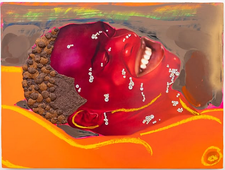
Spray by Devan Shimoyama (2025)
Kyle Coniglio
The characters feel cliche, especially their faces, and the painting of their bodies feels too smooth. My favorite aspect of the painting is the background, especially the wide brushstrokes in the upper left and the ground by the feet of the characters. The plants, color, and feet, feel more interesting than the plain faces and torsos.

Ghost Throuple by Kyle Coniglio (2024)
Sarah Jerome
I liked Embrace VI far more than I liked En eaux vives (Les Glaneurs), mostly because of the brush strokes and hand that feel compelling. Thematically, the works are uninspired, and I was really not a fan of the colors. Jerome could really do without the gold highlights everywhere in En eaux vives (Les Glaneurs) - it doesn't feel like a Klimt, it feels unearned and self-indulgent.


En eaux vives (Les Glaneurs) by Sarah Jerome (2024)
Embrace VI by Sarah Jerome (2024)
Tip Toland
It's fine. I was not super interested in it one way or another. I somewhat liked the dirt and the relatively unsettling nature of the face of the sculpture, but it didn't feel like it was really engaging with anything particularly unsettling. The piece felt more focused on freedom, particularly female freedom, against normative means of expression and modes of control (such as sex, clothing, and activity). In that way, it feels a bit hippy. Which is fine. I'm just not super invested.

Pulse by Tip Toland (2008)
Everybody Else
Matthew Stone
Far and away the worst pieces of the show.
My understanding is that his works are modeled in some kind of 3D program (like Blender or Maya), paint brush strokes are wrapped around the models, and then it is painted by Stone.
There are several issues, including 1. a shallow reverence for the Renaissance 2. a complete lack of interrogation of the form of the body and 3. the replacement of artistic intuition with compositionally appropriate randomness. These issues are related.
Stone's works center on Renaissance-esque figures, positions, and compositions. The white figure in Tangential Chorus looks plainly like Michelangelo's David. But the use of the Renaissance is unengaged with. The work strikes me as animated by a similar shallow reverence for high European art as the RETVRN movement, where Renaissance art is revered simply because it carries social and historical import - as though making your work look like a Renaissance painting automatically creates depth. It does not. Rather than engage through their form with either what it means to create contemporary Renaissance inspired paintings or the thematic interests of Renaissance artists, these works take, wholesale, premade forms and use them to try and convince the viewer that these are great works too. They simply work like stock photos modeled after artists like Titian.
Beyond the paint brush strokes that mask portions of the bodies, which unfortunately work like a gimmick rather than as an interesting visual language, the bodies of the models seem wholly uninterrogated. The bodies are all samey, and you can see that they are computer generated, but that fact is not reckoned with. I'm not saying you need a fat model, but why are the curves of the calves, thighs, arms, neck all unnaturally similar, and unnaturally perfect? Again, because they seem to be stock models. That unnaturalness seems like it wasn't even a consideration - rather, the cheap, computer generated bodies were painted because Stone seems to imply that the perfection attainable through computer programs are what artists like Michelangelo strove to achieve. The work, in that way, misinterprets Renaissance art.
The painterly aspects of the works also fall flat. As mentioned before, the brush strokes wrapped around the models work as a visual gimmick. They don't communicate thematic or conceptual value, they add purely aesthetically, and do so in congruence with random brush strokes and other paint dabs. But these visual choices are exceptionally safe, uninteresting, and wouldn't feel out of place in the art section of TJ Maxx. The random paint and gimmicky brush strokes stem from the same issue: an understanding that to make something a contemporary artwork means to add random paint and unique visual elements that do not compromise the recognizable blueprint of the Renaissance that is foundational to the work's self-importance. The process is robotic, commercial, and shallow.
Together, the central issue seems to be a poorly calibrated appreciation for art. It's "everything art should be" wrapped with a neat little spin of decoration - it's a vacuous love of the bog-standard.

Tangential Chorus by Matthew Stone (2025)

Interface by Matthew Stone (2025)
Samantha Yun Wall
Ugh. A fair representative of Northwest art, being the Betty Bowen Award Winner for 2024 with a show currently at the Seattle Art Museum, Wall's work is just so... bland? Trite? It's hard to describe in a single word, but Wall's work seems to consider itself as more groundbreaking than it is. The signature black and white paintings, replete with unnatural eyes (eyes on a plant-like object, eyes with no pupils in Matriarch) and basic distortions, want to communicate some kind of sense of mystique - but they fail. The works feel flat, uninteresting, and immature. My honest belief is that artists like Wall must be successful because of a combination of social connections together with the general lack of aptitude for art appreciation amongst Seattle art financiers and participants alike.


Diaspore No.13 - Matriarch - Diaspore No. 15 by Samantha Yun Wall (2026, 2024, 2026) respectively
Nadia Waheed
Waheed is a bit all over the place as an artist. This work feels like a high school hippie's art project after smoking a lot of weed and taking mushrooms for like the 10th time. Boring. On the other hand, Waheed's most recent work (July 2026) looks interesting.

Magic Trick by Nadia Waheed (2024)
Emma Stern
A less offensive version of Stone's work from above, Stern's work suffers from similar issues. Stern is at her best when she's being funny, but her work generally feels samey, commercialized and safe within her avenue. And while Stern at least develops some more thought in her work than Stone, Stern's work still feels caged by what appear to be stock lighting, textures, and models.

Pandora (Tosser) by Emma Stern (2024)
Skye Volmar
There's nothing wrong with Volmar's work here, but there's also not much to take in. While I do appreciate making contemporary cadaver drawings, Volmar is not Da Vinci, and I don't particularly care about Volmar's study drawings - there's nothing that really separates Volmar's work here from anyone else but subject matter.

Anonymous (pointed feet, metal toe tag) by Skye Volmar (2024)
Rosalie Gamache
This work feels overly formulaic in its presentation. The process and product don't feel particularly new or conducive to interesting thoughts. I can almost make out faces or bodies in the folds, but they are just unclear enough to where it doesn't feel like that interpretation matters to the painting - it feels like an artifact of the formula that I can start to recognize shapes, rather than a conscious aspect of the work.

Foulees by Rosalie Gamache (2023)
Bryan Rodgers
The colors and general style feel unoriginal. I don't have much to say other than the work feels very safe and I kept walking. The strongest part is the rendering of the light in the small section of the person's face between their forehead and their eye. As a whole, it's fine, I guess, but feels like it works more as a postcard or as a print on a wall among other prints in a college art student's dorm than as a painting.

Cut Flowers by Bryan Rodgers (2025)
Jen Mann
Finely painted, probably the best technical painter of the show. The expression in the eyes and on the lips is especially well executed. If only the subject matter weren't so boring. A technical master that exists purely to create oil paintings of 2016-ish adverts and is still (was ever) impressed with sparkles will never be exciting.

Still Sparkling by Jen Mann (2025)
Gary Hill
I wanted to like this work, but I didn't. The work consisted of a voice over with two black and white videos of what I took to be sign language. Nothing in particular stood out as interesting to me in this piece. Left me feeling underwhelmed.

Twofold (Goats and Sheep) by Gary Hill (1995/2002)